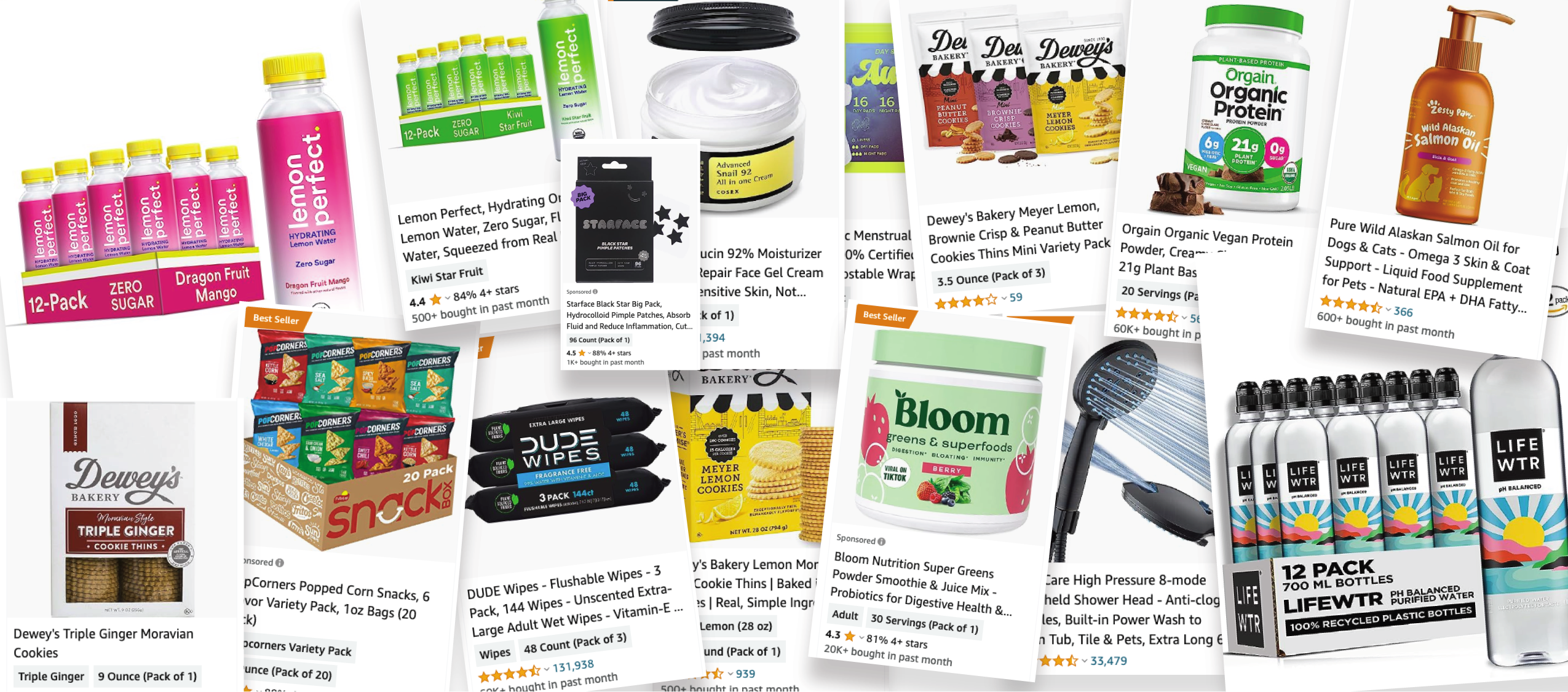
Main Image: The Content Superhero
Posted on: August 18th 2023
Enter the Hero image: a striking visual element that can captivate users and convey a brand’s message in an instant. In this white paper, we’ll explore the many important parts of the hero image and how it can be used to drive conversions and create an engaging Amazon experience.
The hero image should entice click-through by communicating the most important value propositions.
What is a hero image?
At Cartograph, we refer to the main product image that displays in search results and is the first in your detail page image gallery as the “hero image.”
This image is the most significant content attribute and needs to be carefully considered and constantly tested to ensure that the best image is used. The image is used all around Amazon in both ads and free merchandising, so it gets more than 100x the views than any other piece of content.
Image Checklist | Tips & Tricks
When it comes to selecting your hero images, it is important to keep in mind a few key factors to ensure that the image is fully optimized.
1. Image Quality
First, the image should be clear and zoom-able. This means that it should be high quality and allow users to zoom in and out to see the details.
- Zoom-able: Able to be scaled without losing quality
- Clear: No blurry edges or too small of text
2. Consider Mobile Experience
Optimizing your Amazon product listing for mobile experience is crucial in today’s digital landscape. With an increasing number of shoppers using mobile devices to browse and make purchases, a seamless and engaging mobile experience can significantly impact your sales.
Text and images that look OK on your desktop are often illegible on mobile. Ensure all elements are clear to maximize your conversion rate.
3. Maximum Size
Ensure the product takes up the full width and height of the square on Amazon.
Have a tall, or flat product? Consider using visual enhancements below to better fill the space.
4. Enhance Your Visuals
Enhancing your product image captivates customers, highlights key features, and creates a compelling first impression that drives interest and conversions. Visual enhancements that showcase features and bring the product to live have significant impact on click-through rates.
We recommend adding these sensory visuals to your product listings:
- Product Sampling: When showcasing your products, show what the product really looks like outside the package, including texture, shape, and color.
- Add Embellishments: Add embellishments such as drips, splashes, fire, etc., to vividly showcase the product’s features, helping customers grasp its purpose at a glance.
- Movement or Action: Incorporate dynamic elements to infuse movement and demonstrate action of certain features into your image.
- Flavor Elements: Add flavorful elements that visually convey the flavors and aromas of your product to show the customer what your product tastes like.
5. Use Product Box as a Canvas
Showing how much of the product you get in a picture is important for customers to understand the value of their purchase.
Consider adding value propositions to your digital packaging. Any text, callouts, or icons added to the image, must be placed on the product packaging versus a text box or a bubble graphic, otherwise, it violates Amazon’s policy and will be removed.
These callouts, or value propositions, should aim to answer common questions to better compare your product against competitors.
6. Make Sizing Clear
The image packaging should also be used to clearly explain a products size, quantity, or count. It is often very difficult for customers to know how much product they’re ordering.
Split Testing
To have the best-performing images, it is essential to utilize A/B Testing. Testing is never truly “complete”: You should always view your content with a critical eye and try out new improvements.
Always start with a hypothesis. - Chris Moe, CEO
What to consider when performing Amazon’s A/B testing:
- Different colors or brightness: Add color or contrast to your product to enhanced of emphasize features
- Claims: Ensure you remove or add claims to specific product listing and packaging
- Keyword placement in titles: Add color or contrast to your product to enhanced of emphasize features
- Angle shots: Change hero images angle to emphasize claims or size of product
Before starting a test have a documented goal or result you expect to happen.
Will in increase conversion or click-through rates? Or are you trying to increase mobile or desktop performance?
These are just a few things to consider when testing; however, the goal should be to learn what is working and what is not.
Conclusion
A hero image is the most important showcase of a brand’s Amazon product. It captures attention and conveys the business’s brand through a photo, illustration, or video, often with a call-to-action button.
Consider the message and emotions you want to convey and ensure the call-to-action. There are often multiple visual ways to better show and tell the customer exactly what they’re getting and why it’s valuable. Hero images create engaging experiences, drive conversions and improve performance while focusing on ongoing improvements.